Before
- • Shochu was new and unfamiliar to Indian consumers
- • The website lacked clear product context and education
- • Users were curious, but unsure — slowing down purchase decisions
- • Sales conversations required heavy explanation
After
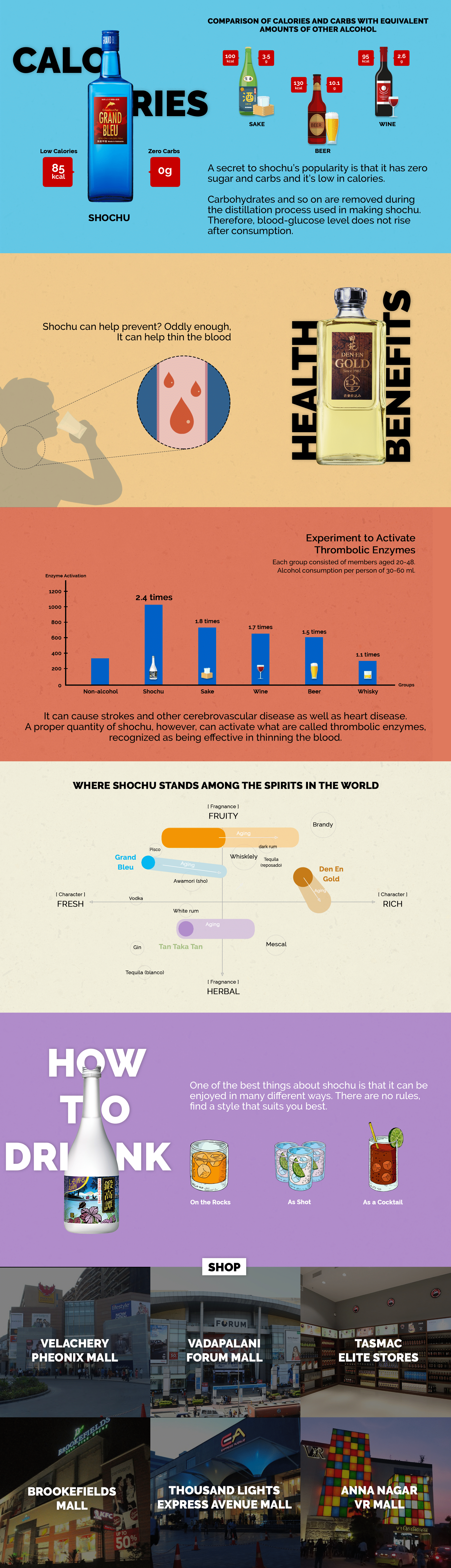
- • Built a visual, infographic-led product page
- • Broke down benefits, calories, carbs, and distillation into simple visuals
- • Used comparisons and storytelling to explain Shochu at a glance
- • Turned product education into an engaging scroll experience
This was a natural extension of the product page, designed to go deeper—educating first, building trust, and guiding curious visitors closer to purchase.
Results
- • Faster product understanding → higher purchase confidence
- • Reduced friction in the decision-making journey
- • Page became a sales enablement asset across marketing and distributor conversations
- • Helped support increased interest and sales for a brand-new category
Clear product education turned curiosity into confidence — and confidence into 15% increase in sales.
15
Days
+15%
Sales Increase